Making a Japanese Typeface

One thing I have always strived to do is step outside the box, especially when there is a chance to learn something new. I had an opportunity to do just that while I was studying at York University and Sheridan College in the YSDN program. One of my classes I took was in Typeface Design. The objective of the course was to learn how to design our very own typeface that could be used every day. My professor for that course told us we were not limited to designing for our alphabet, so that got me thinking, “could I design a typeface in Kana?”

I have been practising Japanese on my spare time as I was studying; sadly I lived too far from York campus to actually take the 1 hour classes 3 days a week. Despite only using a textbook I had bought from Chapters, I had learned all the Hiragana characters very quickly. When you’re designing a typeface in a foreign language, it is important to know about the characters you’re creating.

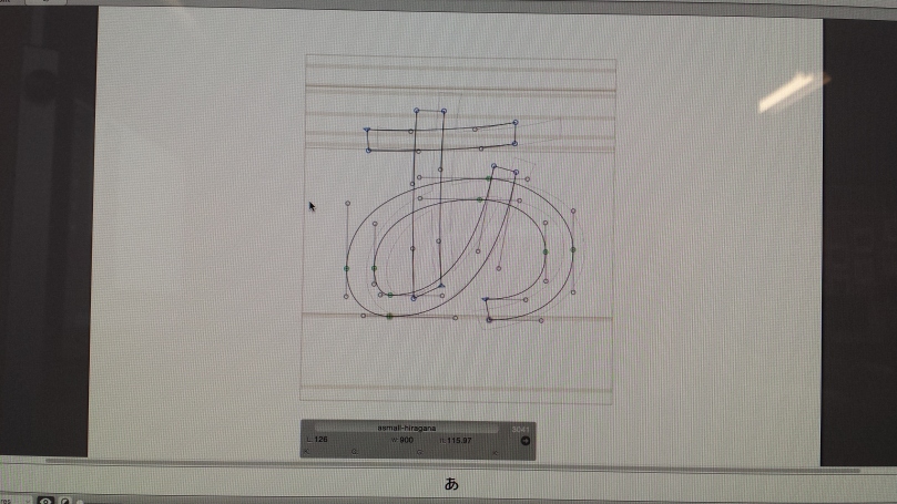
As I was the only person in the class who had chosen to design Hiragana characters, I had a very different workflow from my classmates for the entirety of the semester. While my class was beginning with the “blueprint” letters of our alphabet (the letters whose shapes are adapted for most other letters in the alphabet), I had to improvise with the Hiragana. I had to do something I had never done before in studying Japanese—studying the aesthetic shapes of the characters and relationships they had with other characters in the alphabet. From doing this, I was able to draft out a workflow plan for when I’d complete designing each letter, based on their overall design.

To begin, I took a Japanese typeface that was already a default on the Mac computer and created outlines in my typeface file. By doing this, I had a skeleton to work with. Since the typeface I was using had a very different stroke weight and shape from what I wanted in my new typeface, most of the work was matching my desired stroke weight (based on Source Sans) and then evening out the result to have well-rounded characters.

20151123_103705
Work space view on Glyphs of my typeface. The Katakana are in grey because those will have to be completed separately.

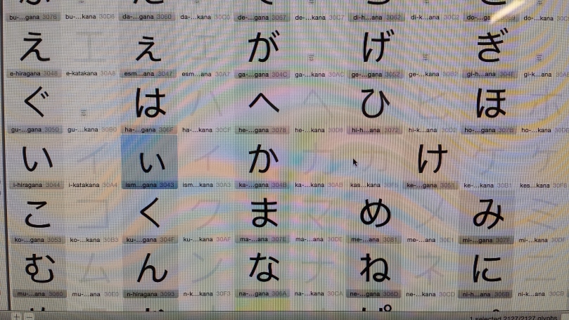
Using Glyphs on Mac, I designed the 68 primarily used Hiragana characters by the end of the semester. These characters were exported as a font file and tested multiple times throughout the process to perfect the spaces between the characters in any practical order. Since I knew basic Japanese phonetic language structure, I was able to type words and sentences and see the relationships between letters as they would typically be placed. This brings me to another huge difference between my assignment and that of most of my other classmates. Kana has uniform spacing. All the characters are the same width, just like letters on a typewriter. Not all the characters were easy to set up this way on the Glyphs grid. For instance, characters like く (ku), よ(yo) and て (te) did not fill up much space within their boundaries like other characters. However, it is not something you can simply solve by adding a serif or two, like you can with “i” and “t” for our alphabet. Instead, I had to tweak the character so that its use of positive and negative space could be comparable to other characters. I also had the option of shifting them left and right within their boundary. This was important for cases involving them being juxtaposed with characters having ten ten and maru, like ず (zu), じ (ji) and ぱ (pa) that unavoidably have very little negative space to the right side of their boundaries.

20151123_103557
A typical workstation for a character of my typeface. Note the box surrounding it.

Once I had finished fine-tuning all the characters, I was ready to create my type specimen. This is like the profile, the album of a typeface, a way to show off its features. For my specimen I wanted to utilize the bold qualities of the character strokes using only black and white. There was no sense in drawing any more attention through use of colour when the aesthetic look of the characters can be shown off with only 2 values. Deciding what to include with a limit of 12 pages including the front and back cover was a bit tricky. Especially when there was only criteria for 4 sections I had to include: idea behind the design, character set, list of features and how the type looks in different sizes. Any space left over in the book was completely open to us, so I did a bit of research in what else to include for a type specimen with Kana. I ended up finding a poem that includes every Hiragana character at least once. This was a great way to see just how well my typeface looked. It also made a great introduction. For the inside covers, I created collage-like illustrations with my characters all in different sizes. At the front of the book especially, this really created a feeling to draw the viewer in.

dsc_0039_medium
Final printed copy of the Jasu Sans typeface specimen

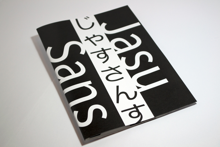
You can see the inside of this type specimen in more detail on my portfolio website.

Overall, I really enjoyed working on this project and I hope to continue to expand the typeface in the near future by including Katakana. Hopefully then, I can update this type specimen and showcase the entire Kana character set.

Theme of ‘Music Connects’

The following is a excerpt from my book Music Connects, one of my final projects. It is one of my favourite articles I have written.

Why do you listen to music? Are you paying tribute to a particular band or singer? Do you enjoy the experience of the sounds and the harmonies? Do you like a particular genre apart from another? Does the music you listen to satisfy a feeling at a particular point of time? Is it a way to lift your spirits, pump your blood or help you focus? Chances are, music does a lot of these things for you.

Do you know there are approximately 5 million different registered artists around the world? Think about how many there are that create music just like that which you love, that you still have yet to discover! Think about the millions that aren’t registered and are still trying to build a fan-base. Imagine how easily you can broaden your preference with just a bit of curiosity and Google search.

Some music is sung in English, but there is music everywhere around the globe, sung in many different languages, some in genres native to that country or culture, some influenced by each other. The map of music is a network of a wide array of different influences and modes of communication.

So why is so much music from other countries and cultures not prominent or easy to find? Why are they not available in your local music store? The answer is demand. Not enough people in that region care to listen to it. For instance, you can easily buy a Madonna CD in Japan, because Western music is extremely popular in that country. Yet, you’d have to probably keep your fingers crossed when entering a second-hand music store in Toronto hoping that you’d find a CD by Ayumi Hamasaki, who is deemed the “Empress of J-pop”, because only specific demographics in Western society—for instance anime fans—would be interested in her works.
This brings me to an important quote that resonated in me the moment I heard it…

“Who the hell speaks Swedish? The important thing is not the nonsense the voices are saying but what the voices are feeling.”

– Peter Van Houten on Swedish hip-hop from the Fault in Our Stars

What does this mean? Houten is not bashing Swedish people. He is not saying their language is not practiced today, because it is. As soon as I heard the song the movie was showcasing, “Bomfalleralla” by Afasi och Filthy, I searched for other Swedish music and experimented to get a better grasp on the concept.

What he is saying is that if you cannot understand Swedish, you can still appreciate what you are hearing. You can still enjoy the sound of the music through the singer’s expression and tonality. It is commonly said that voice is an instrument, even though it has other meaning in addition to just aesthetic sound—language.

When I approach music and look for new sounds, I constantly keep this in mind. Focusing on the feeling in music is how I discovered Mandopop, Latin, Visual Kei and other non-English music genres enjoyable to listen to. Language is usually the last thing in consideration when I decide if I like a singer or a song. If I can feel the emotion and expression through their vocals, become emotionally attached to the passion they evoke and the overall harmonies of the vocals paired with the other instruments, then I will most likely consider exploring more of their works.

I must acknowledge that not everyone has this mode of thinking when they listen to music. I have heard people say they don’t listen to a particular artist but only to a song if it sounds good to them, and they don’t really care who the artist is. There are people who stick with a single genre because they only enjoy that type of sound and do not wish to experiment. There are people who find everything these days “sounds the same”. Some people who I know have told me straight out that they cannot appreciate a song if they don’t understand the lyrics, no matter how well the genre matches with their listening preference. Then, strangely, if we were to consider instrumental works, suddenly the country of origin only matters based on their influences of compositions and native instruments. The language barrier is no longer relevant.

To me this is a real shame. So many artists miss out on a potentially larger international fan-base because the demand is so low. It is low not because people just don’t want to hear their music. It is low because people out of the loop haven’t been exposed much to it in the first place to have an opinion at all. There are probably thousands of people in this country who would love to hear African music but just don’t know it yet because they never thought of it, having never been exposed to it.
Perhaps the story behind how I came to be such a big believer in the importance of worldwide taste in music would help solidify my argument.

When I was young, I watched Pokémon and Sailor Moon on TV. I didn’t discover until I was nearly going into high school that I had been watching anime. It was around that time that I became very curious of Japanese animation. When I watched more authentic anime—that which hasn’t been dubbed and edited to censor certain aspects of the Japanese culture—I discovered J-pop and J-rock for the opening and ending credits. I was already captivated by the animation, so I was exposed to these songs for an entire season at a time, so well over 10 plays each. This caused me to develop a certain attachment to the overall linguistic sound of Japanese used in song. It got to a point where I developed such an open mind that I could enjoy the music not just because it was nostalgic, but because I didn’t even care that I couldn’t understand what the singers were saying.

I put a lot of Japanese music on my iPod, and one day when I had taken it to school, I let a boy who sat next to me listen to a song. Since I had it on shuffle, it transitioned from the track he first listened to to a Japanese pop-rock song from an anime I used to watch. He listened to the entire track and after it had finished, he told me how amazing it was to hear a pop-rock song—epic-sounding at that—in Japanese!

Now, to put things in perspective, this guy was a jock. He was on the school football team. I had never asked him but based on his enthusiasm and surprise that Japanese pop-rock existed, he had never seriously watched an anime in his life. This was a guy completely out of the Western Japanese music fan demographic, yet being exposed to the song outside of the anime experience, he was still able to appreciate what he heard.
This is why I strongly believe that an open mind and spontaneous exposure to music outside one’s comfort zone can entice, excite, change people’s lives and teach them more about the world.